Why We’re in Love with American Interior Design
By Alina Clough
When we think of interior design, we often think of other countries. There’s natural and neutral Scandinavian minimalism and French fancy maximalism. While it’s become popular to claim that America has no culture, its interior design reflects its rich history and multifaceted makeup.
1700s: American Colonial
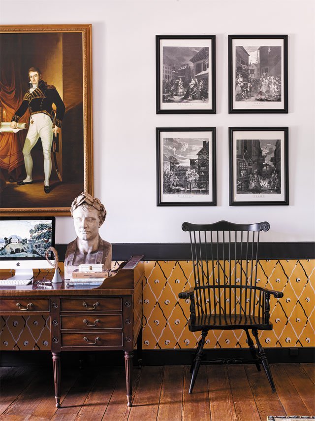
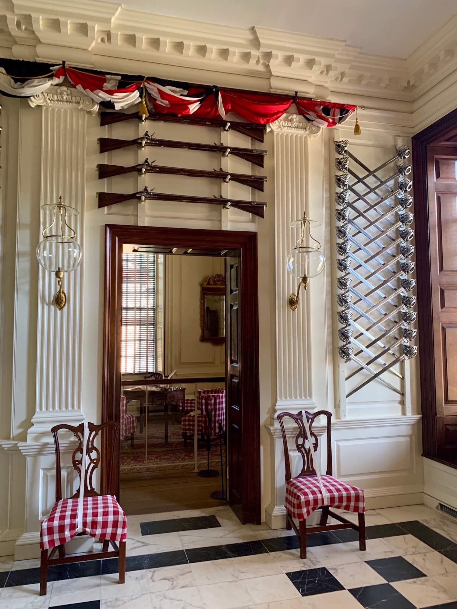
The American Colonial originated with the world’s largest empire landing on North American shores. The style brings English opulence down to earth with more muted tones and rustic furniture. Landscape paintings reference forests and fields while display dishes in open shelving feature early settlers. Tools and cast iron pans hang on the walls. Quilts and braided rugs appear throughout. Traditional lighting, such as candles, fireplaces, and sconces, are essential to the aesthetic.
1800s: Traditional
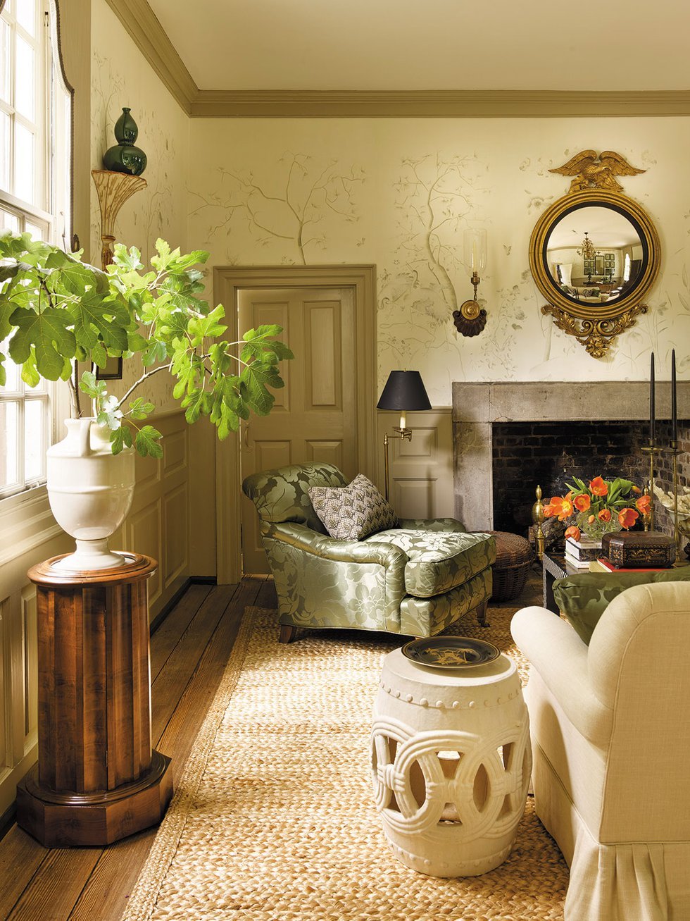
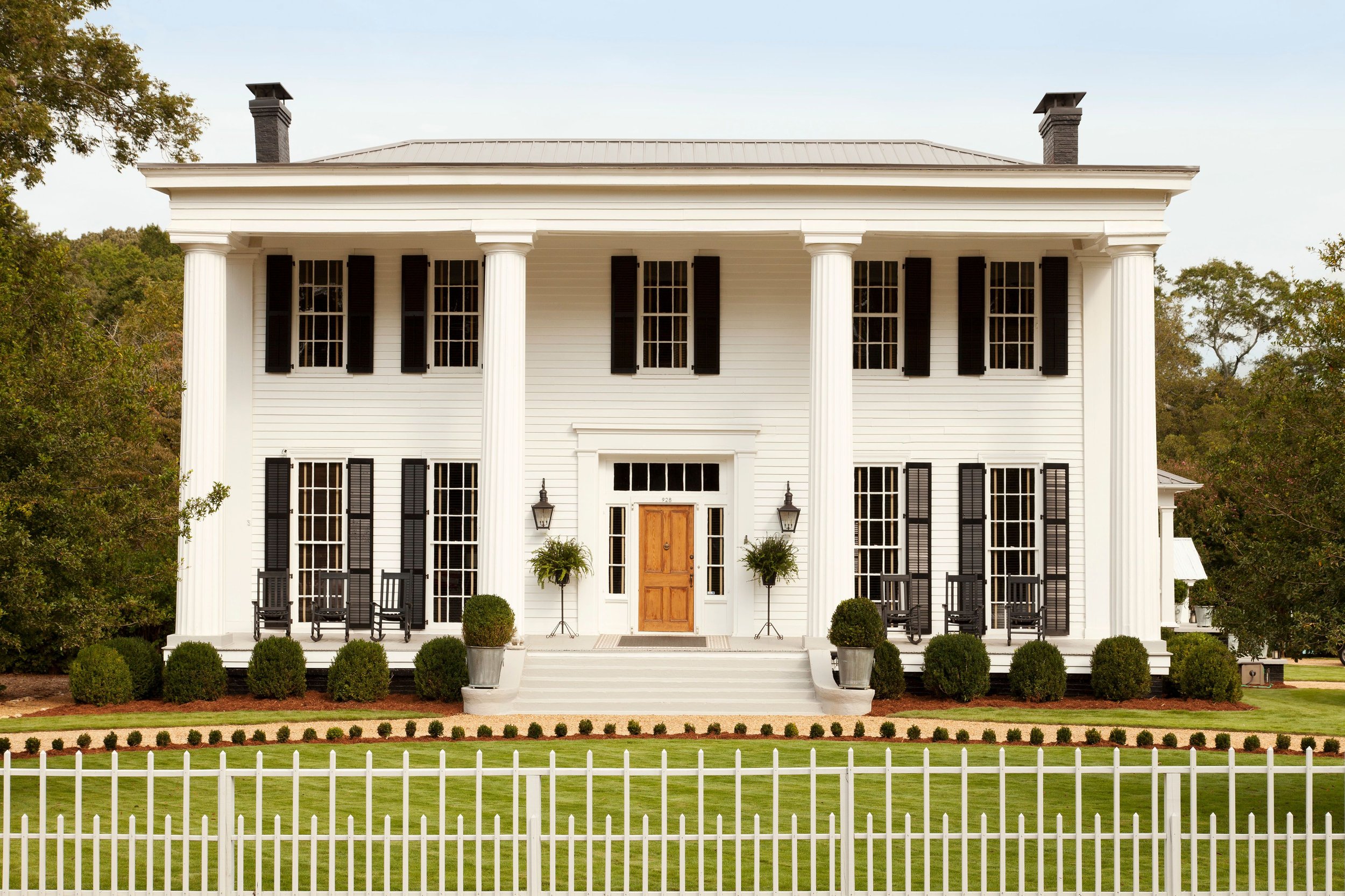
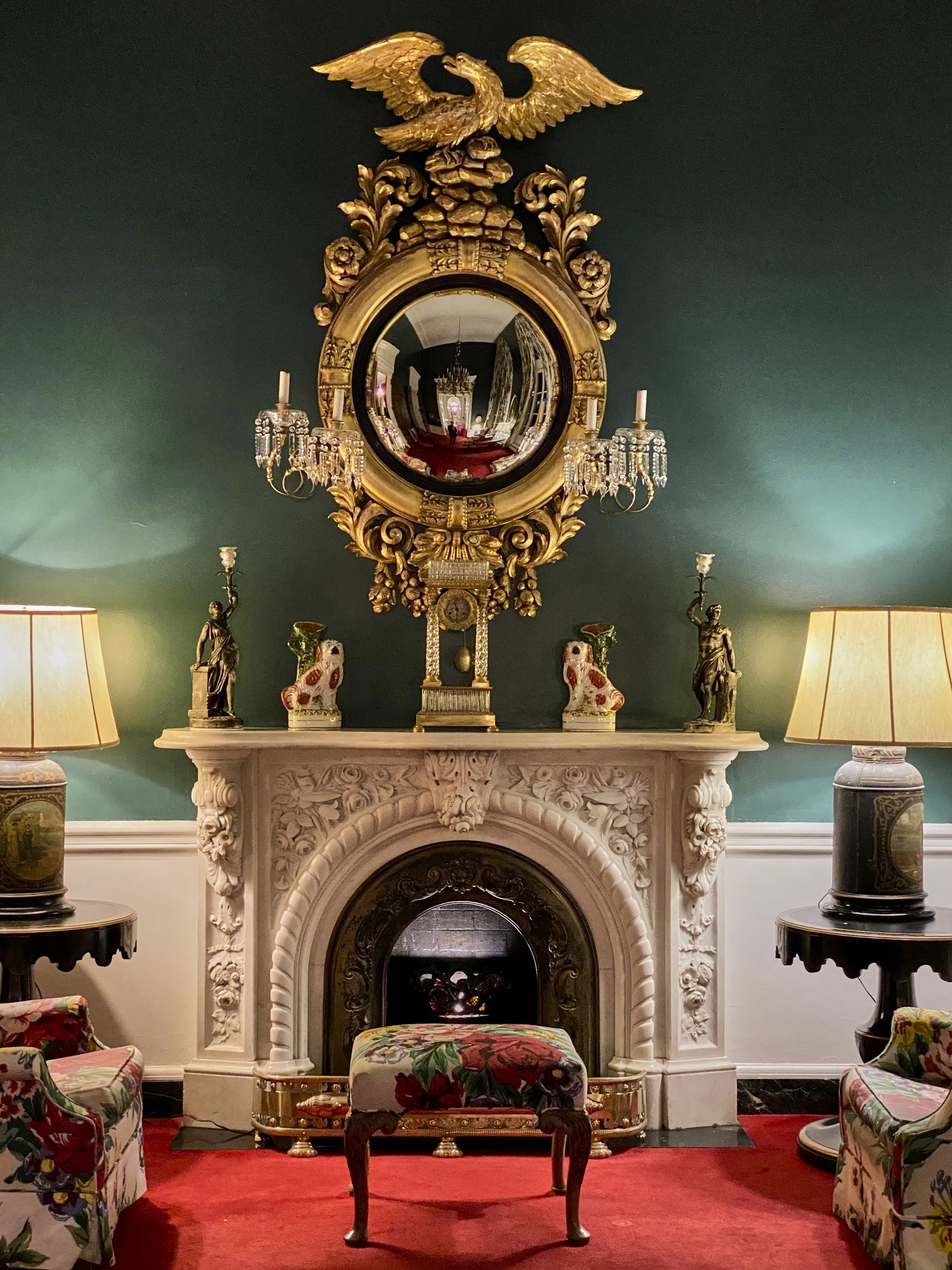
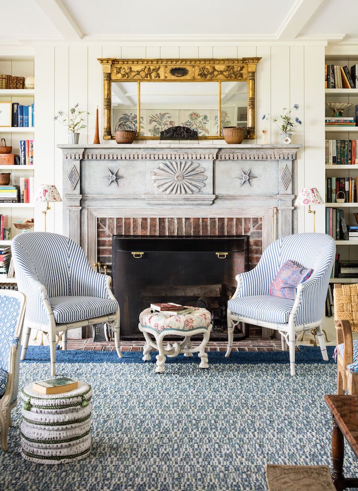
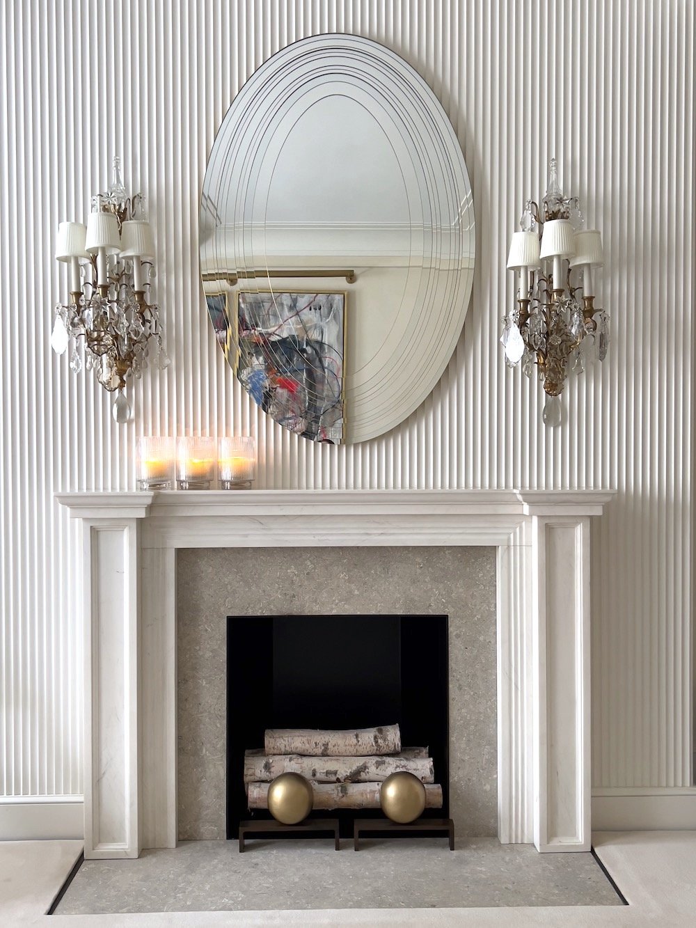
Traditional interior design marked America’s evolution into the antebellum and Civil War eras. This style is the core of most American design, distinctly settled and non-European. Federal, antebellum, victorian, and Greek revivals were commonly built, depending on geography. Inside, a timeless style, it modernizes colonial a bit, mixing candles with lamps, swapping unfinished wood for painted or darker-stained, polished wood, and adding molding, built-in bookcases, and more established mantles.
Late 1800s: Western
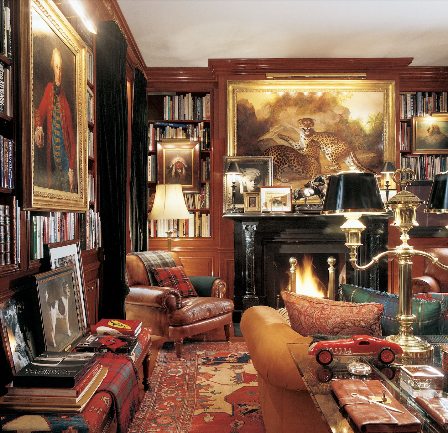
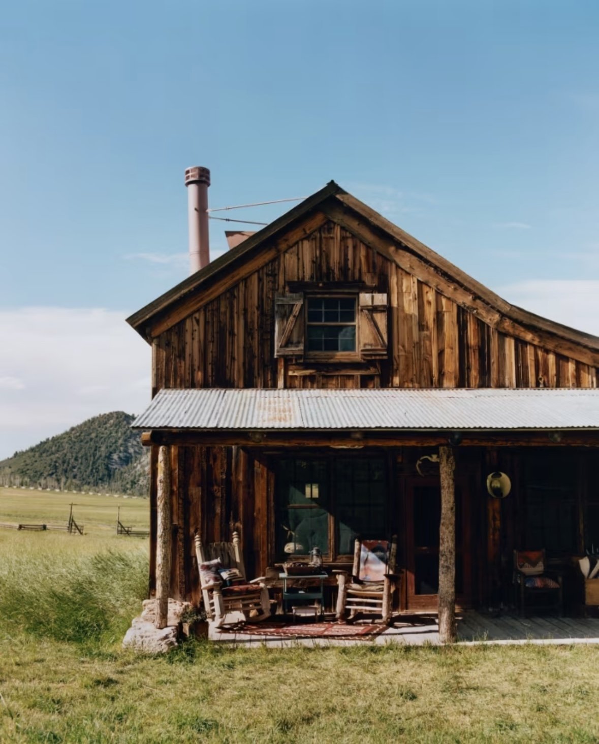
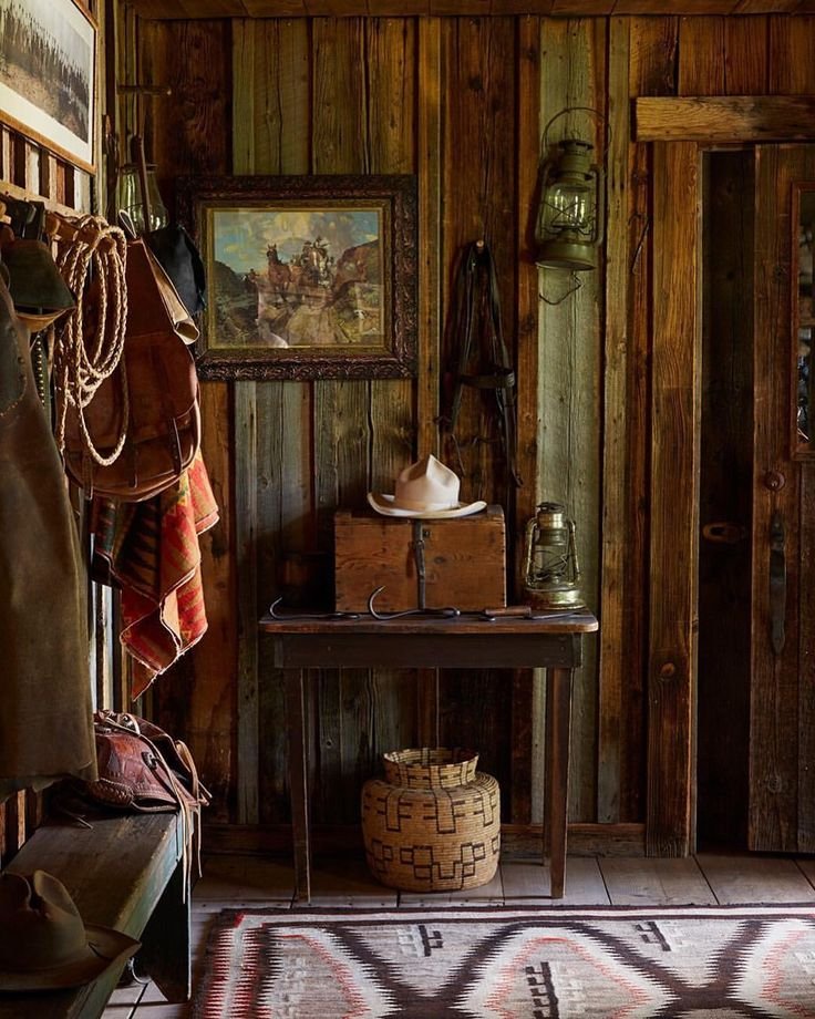
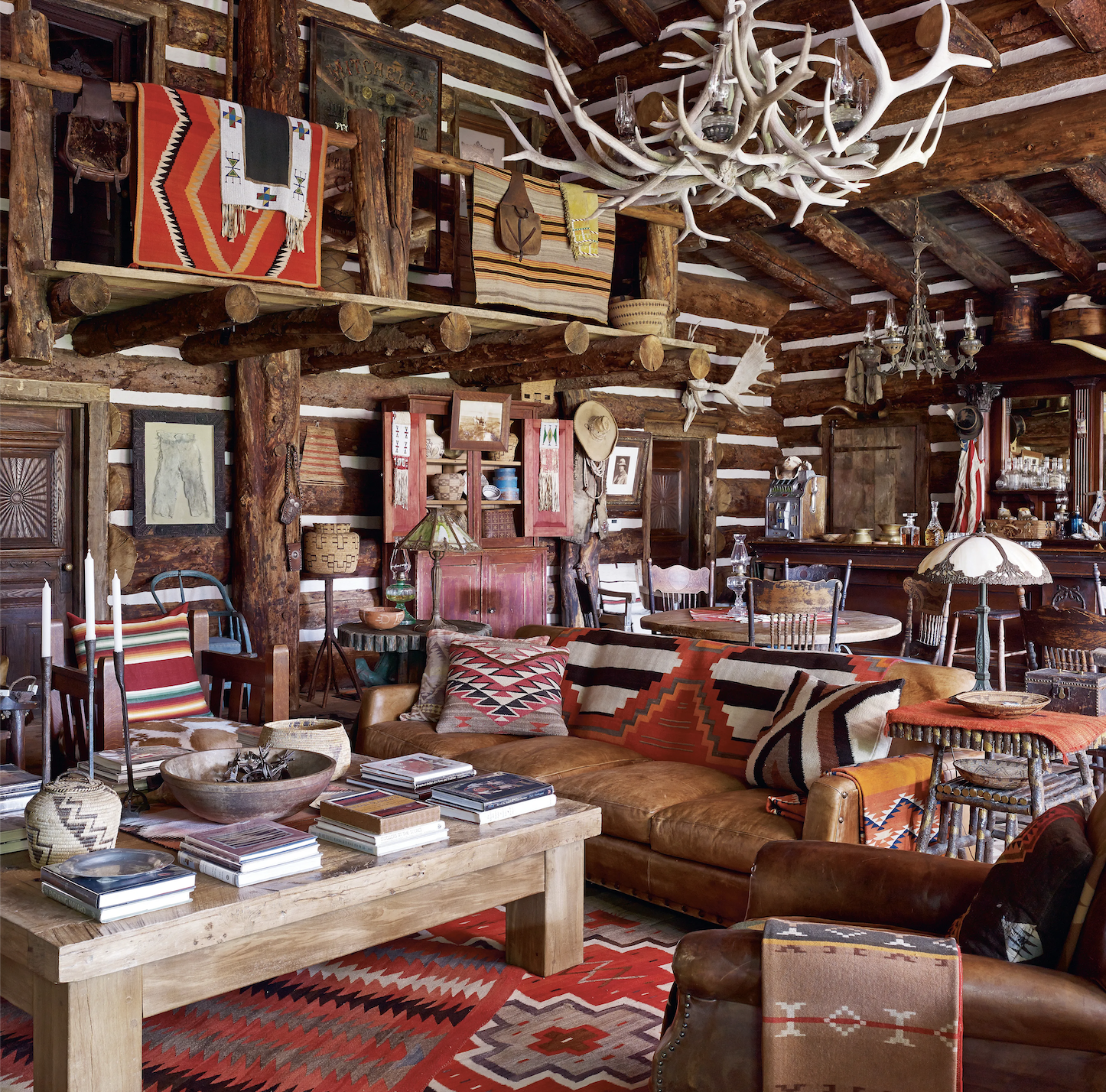
As America reached manifest destiny, so did its tastes. As the West developed a different culture from the East, its homes followed suit. Western interior design emerged from Lewis and Clark and other explorers of the Oregon Trail, who settled among moose, bears, and mountains. Cabins and lodges became the main architecture, often featuring the spoils of hunting like mounted antlers and taxidermy, and the materials of cultivated land like stone fireplaces and exposed-log interiors. Ralph Lauren’s infamous ranch fits the bill.
Turn of the 20th Century: Southwestern
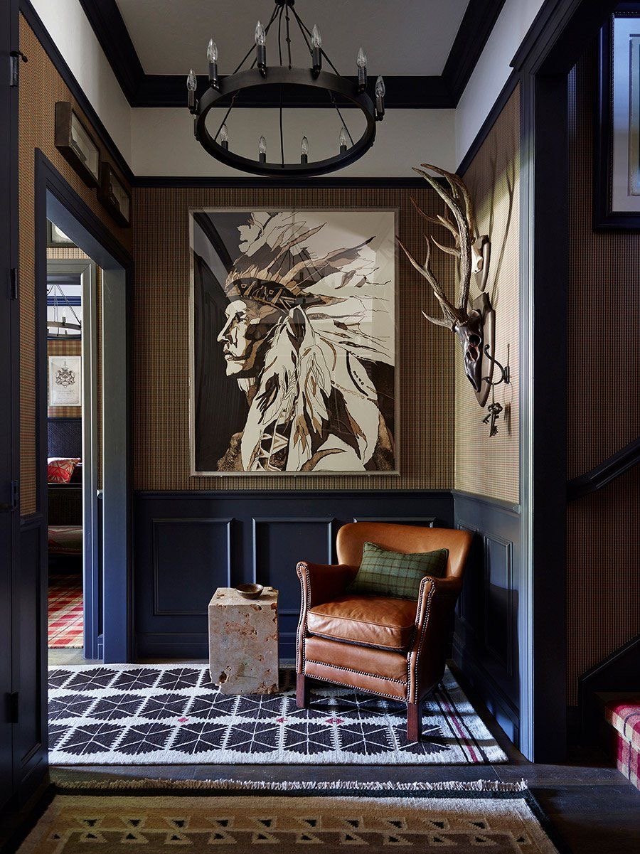
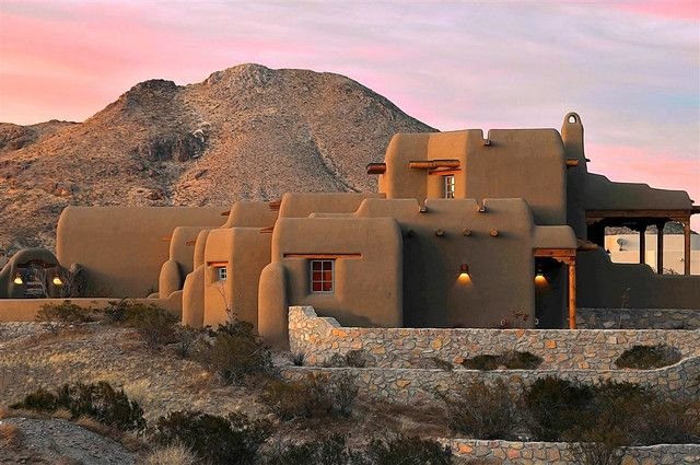
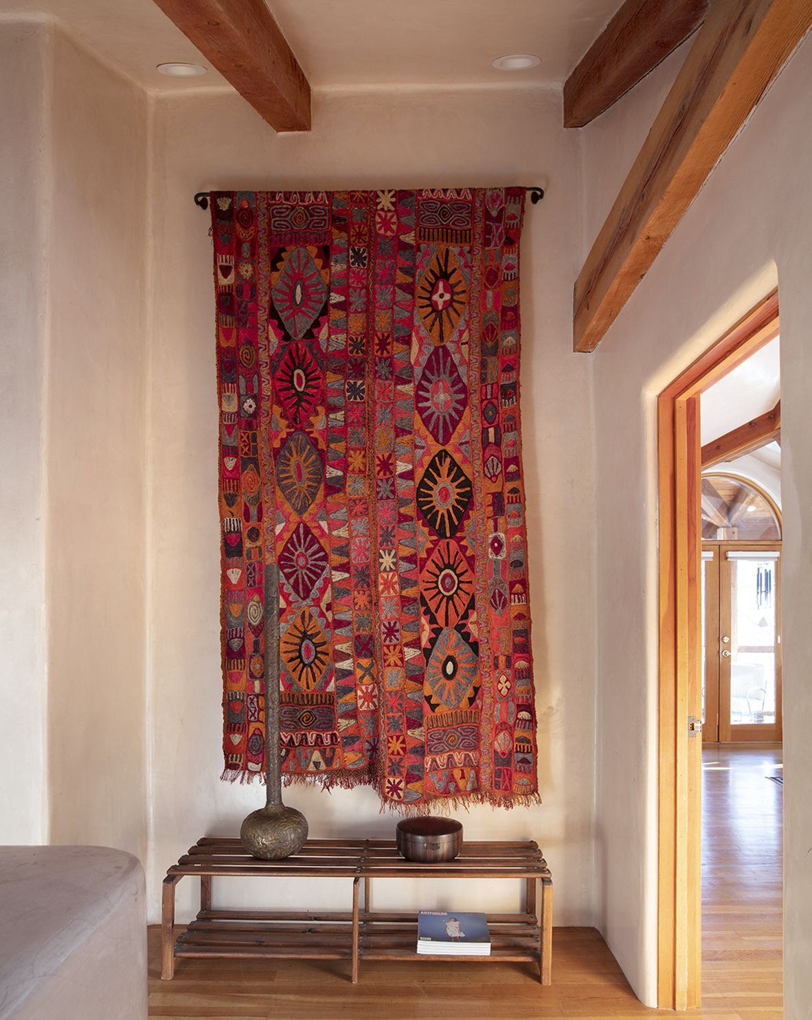
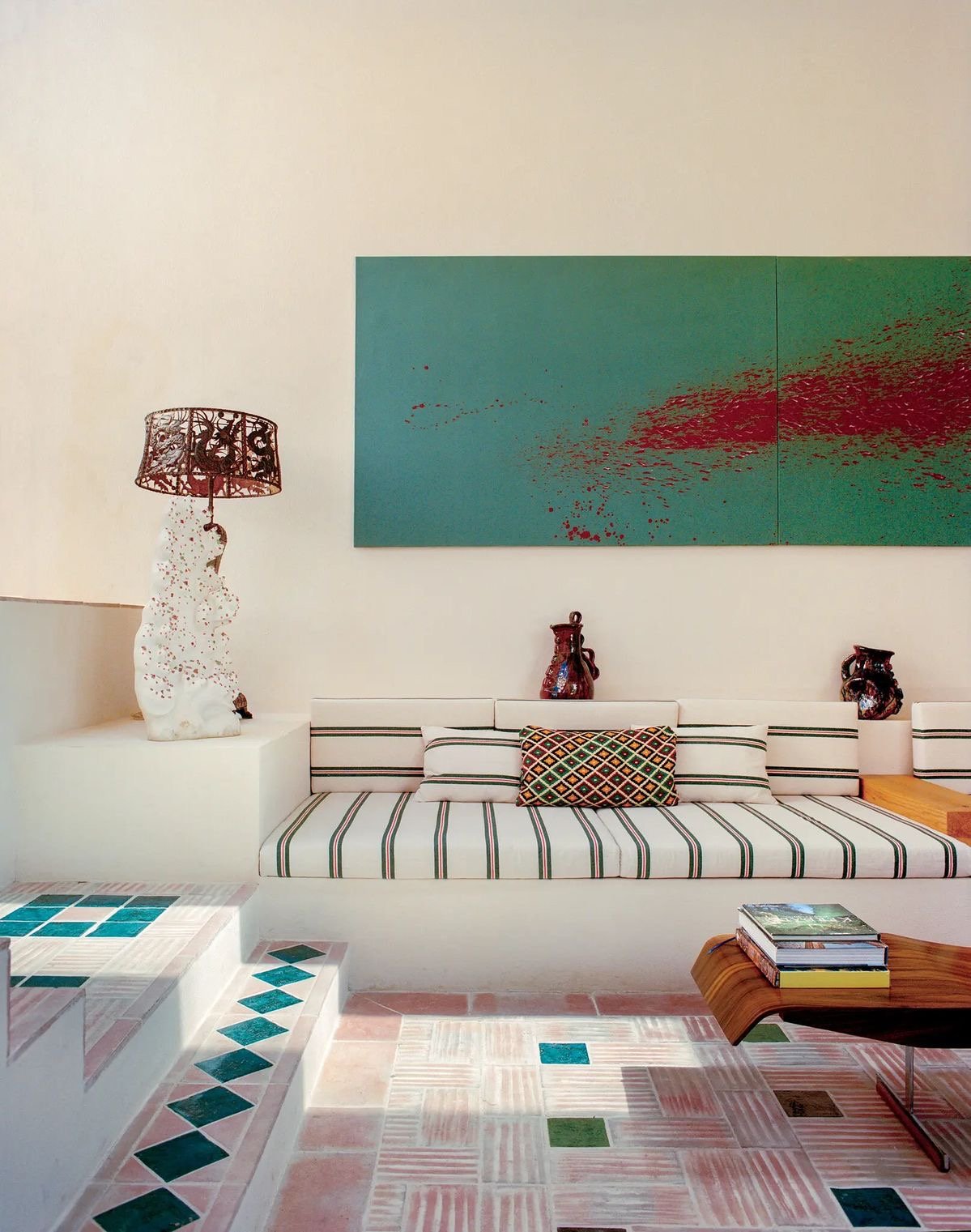
Instead of the mountains, Southwestern style channels the deserts. The colors reflect the sun-baked soil such as clay and vegetation such as cacti, with low-saturation light pinks, teals, and tans. White stucco structures get their influence from Spanish Catholic missionaries, while Aztec-style textiles nod to Native American roots. Also rustic, the style incorporates cow hides, sheep skins, and leather.
Roaring 20s: Hollywood regency
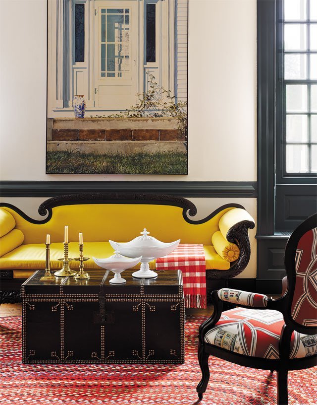
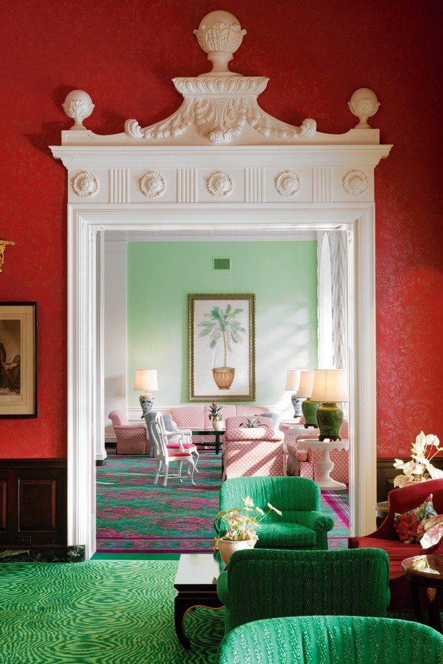
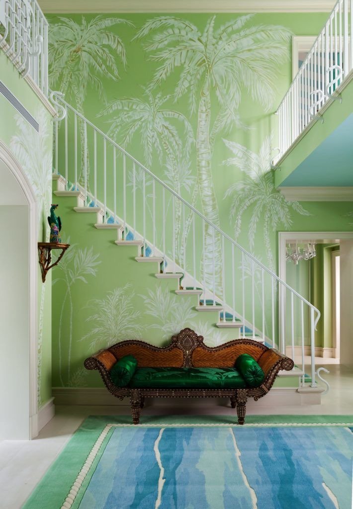
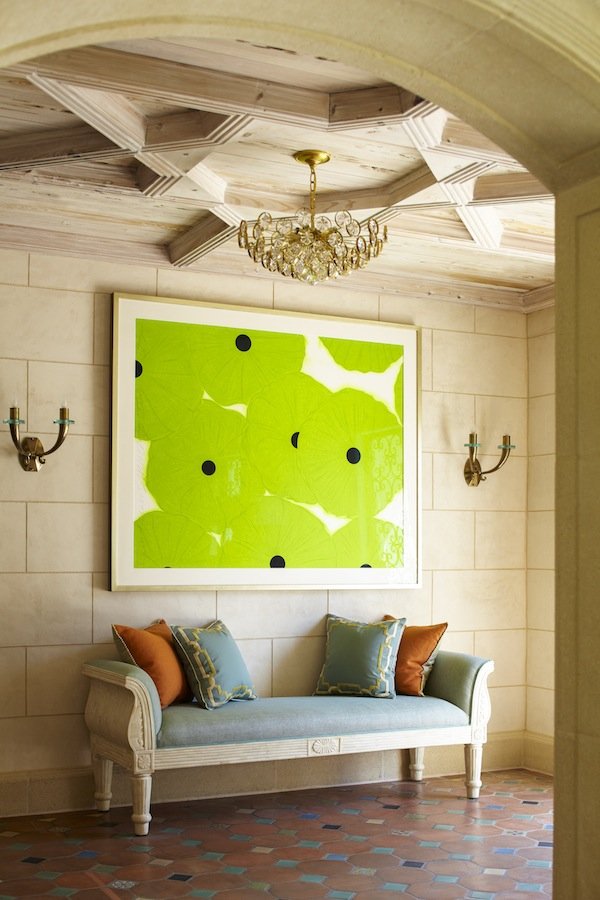
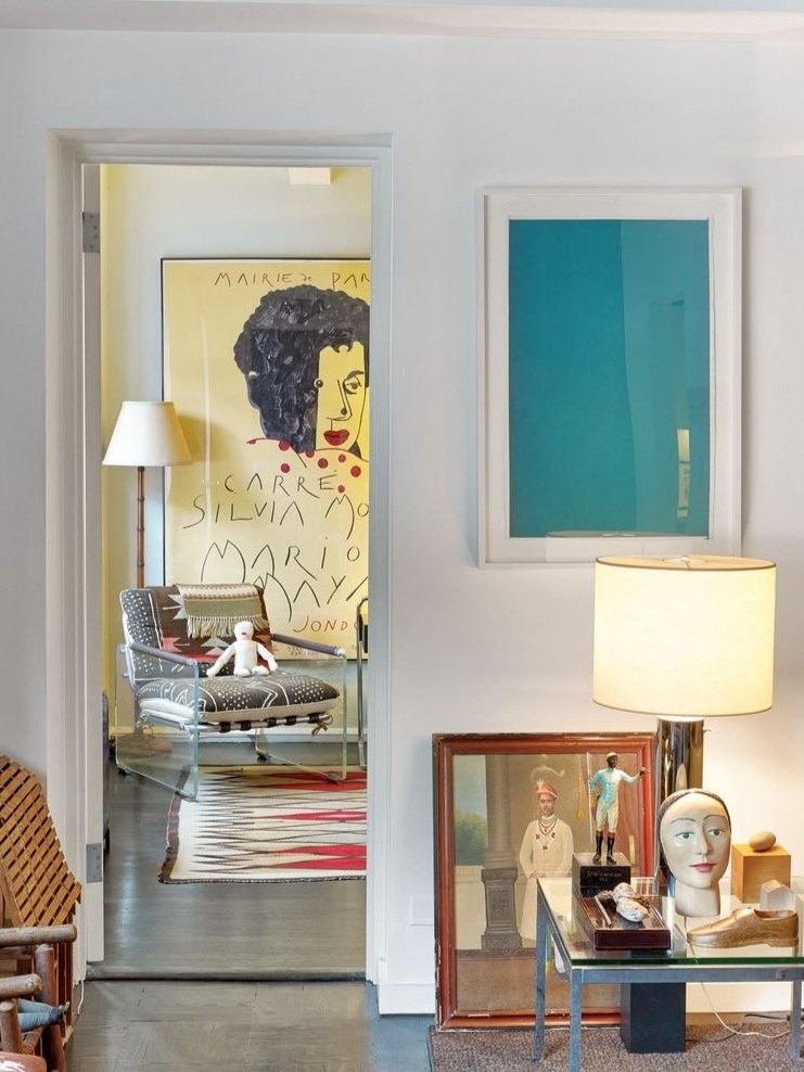
Hollywood regency style is as uniquely American as our film industry, flaunting the glamour of the Golden Age of cinema. The style makes a statement with high-contrast colors, and often borrows metallic elements and other art-deco notes from the rest of the 1920s. Bold patterns and textures make the most of this style’s surge to fame. The Greenbrier in West Virginia, designed by Dorthy Draper, is a great example. Bonus points for abstract or pop art, and no shame for having a bottle of bubbly (or twelve) on display. Gatsby himself should feel right at home.
Depression and Post-War: Cape Cod
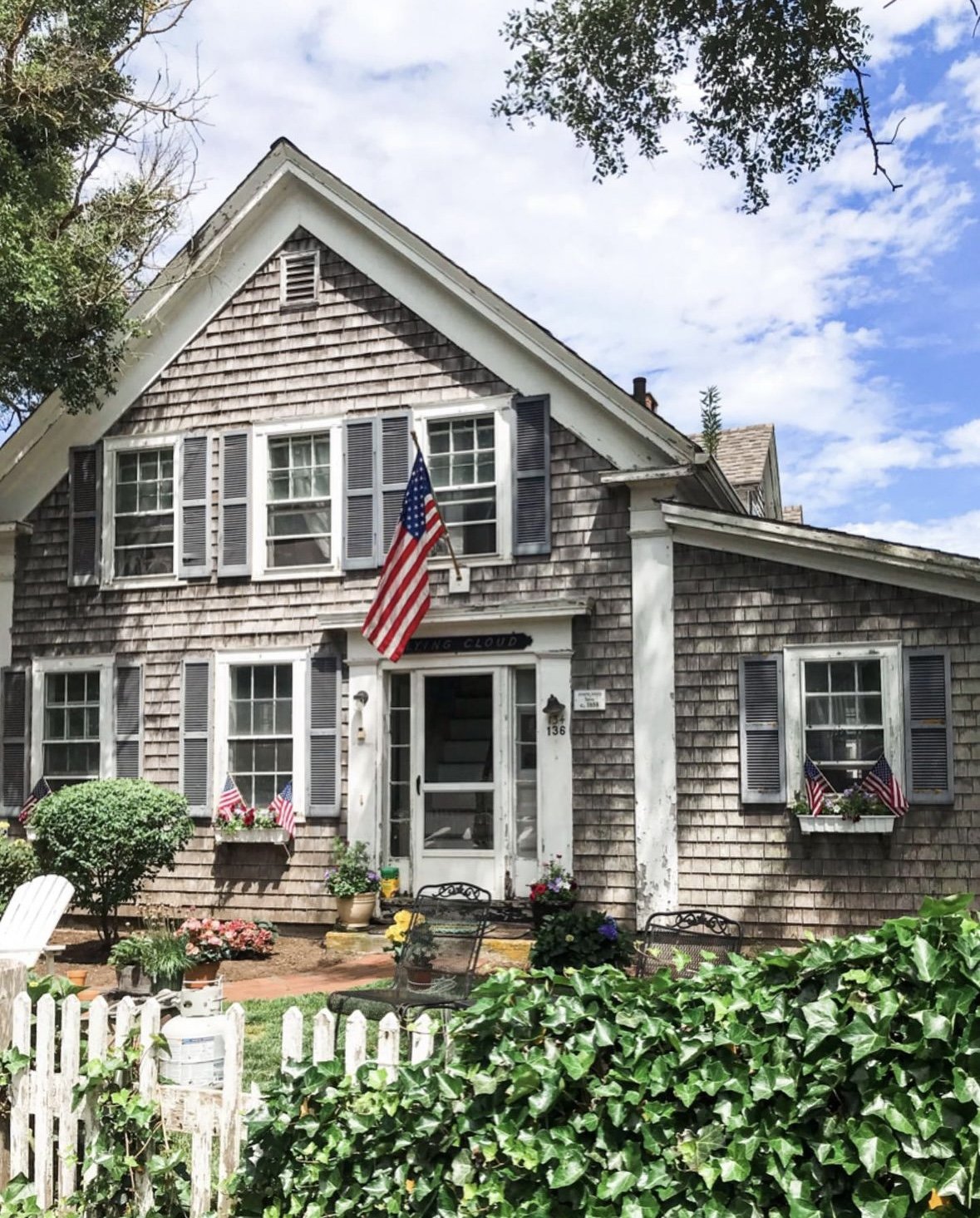
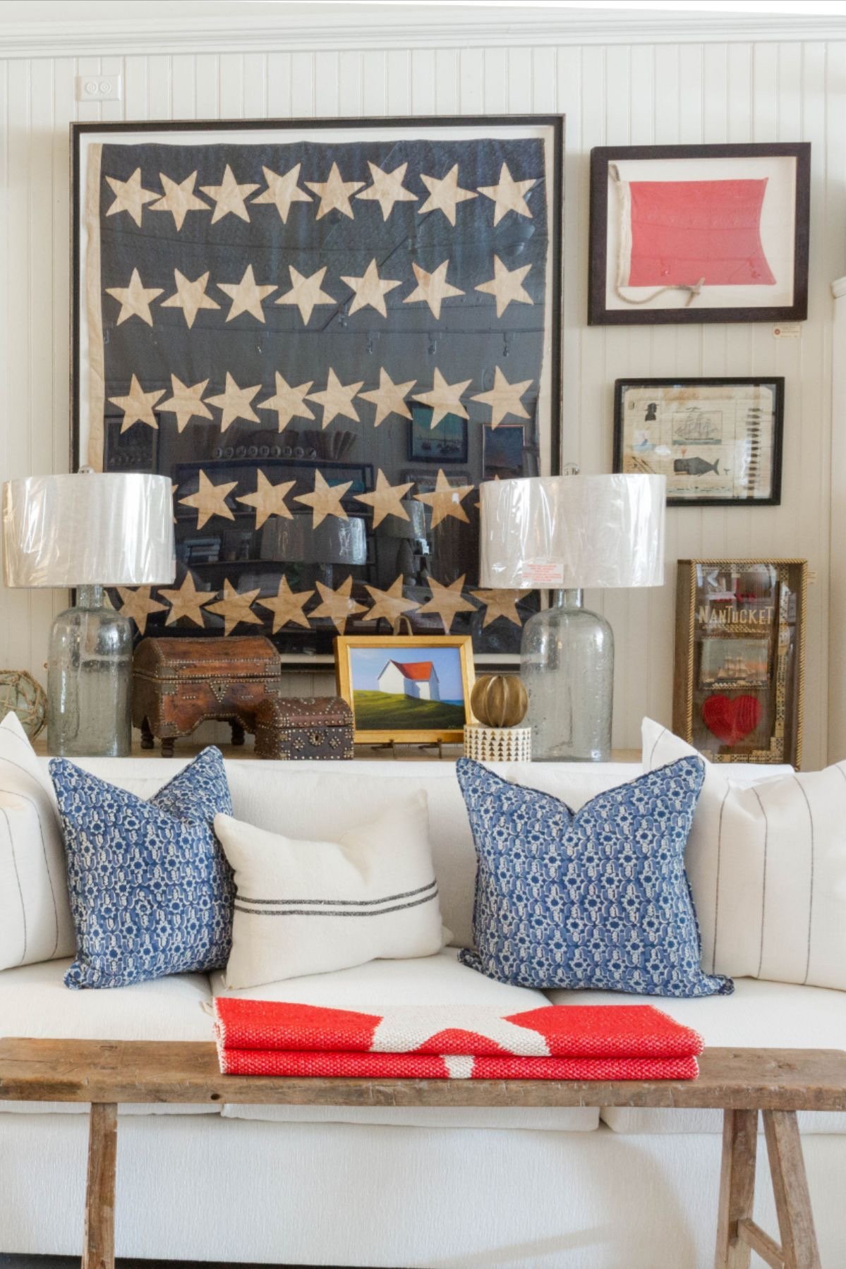
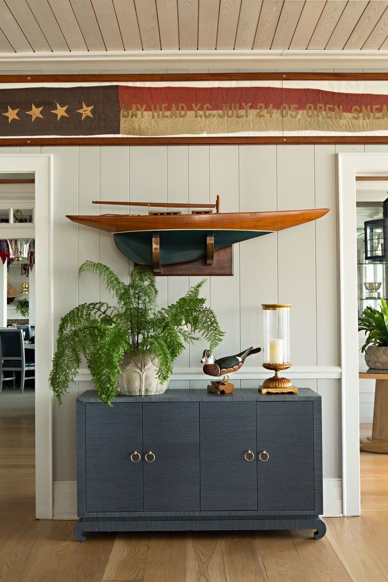
In the wake of the Great Depression, America rolled back to the basics. Most major interior design trends stem from geography, and the Cape Cod revival was no exception. This style grew out of America’s renewed focus on the East Coast during much of the depression and war effort. The surge in Cape Cod homes was driven in large part by their modest size and practicality. Cape Cod style is, in many ways, American traditional for the 20th century. Cape Cod interiors are typically blue and white with coastal elements such as nautical patterns and natural textures.
40s-60s: Mid-Century Modern
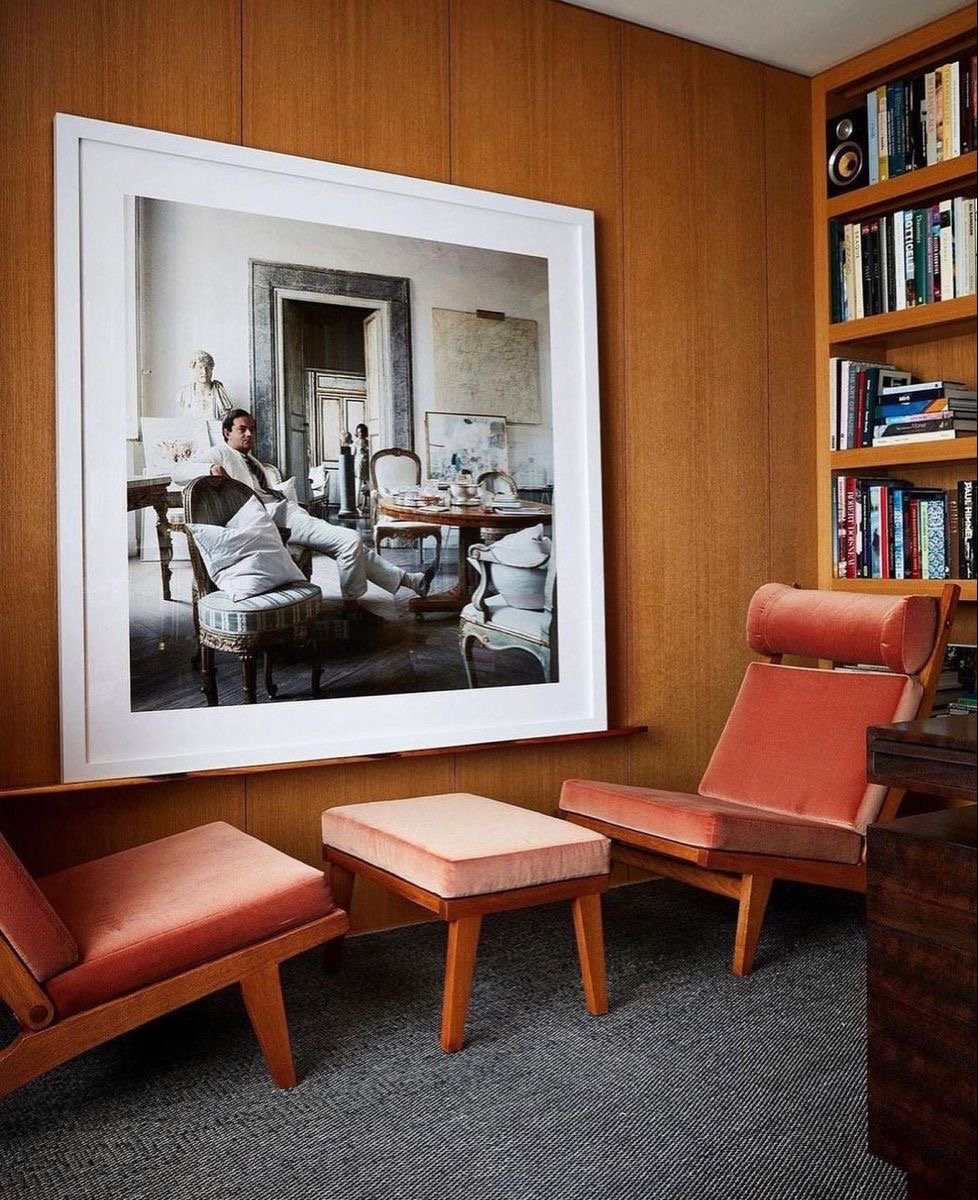
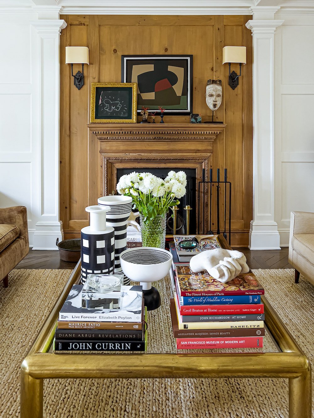
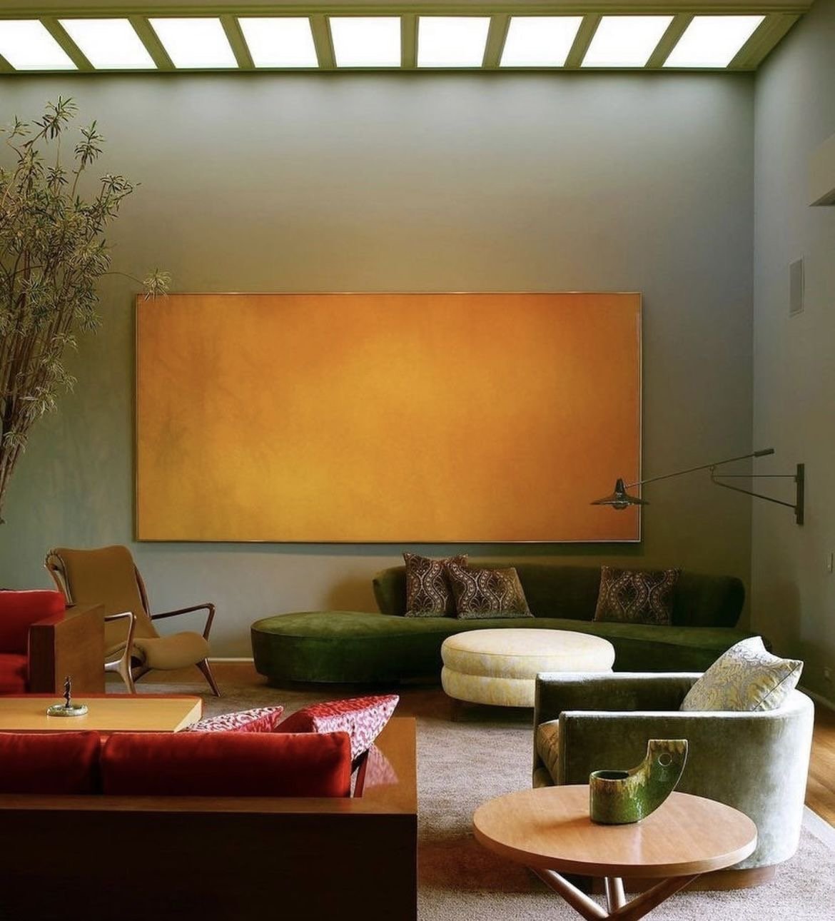
America’s style got more adventurous in the following decades. The mid-century was determined to put itself on the map. Mid-century style is about shape as much as color and texture, emphasizing sleek, often playful furniture with a futuristic feel. The color palette tends to be more muted, playing well with bold wood stains and a little bit of edge. Mid-century style is the American version of Japanese and Scandinavian-style minimalism, though opting for more and deeper colors than either of those foreign counterparts.
70s: Bohemian
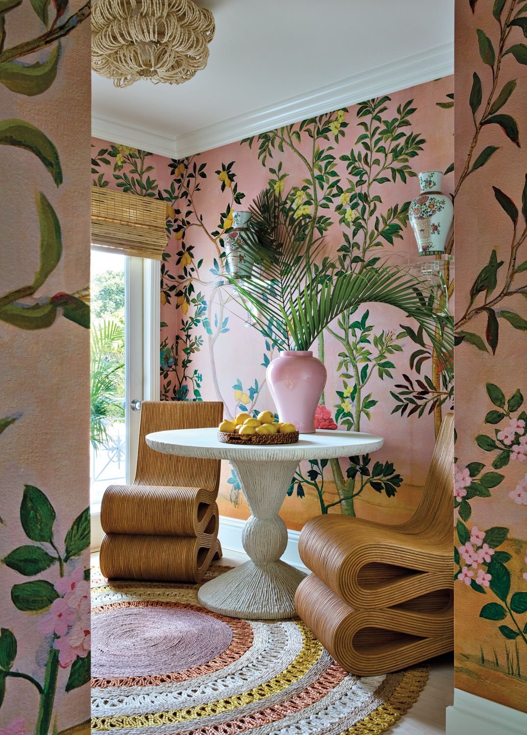
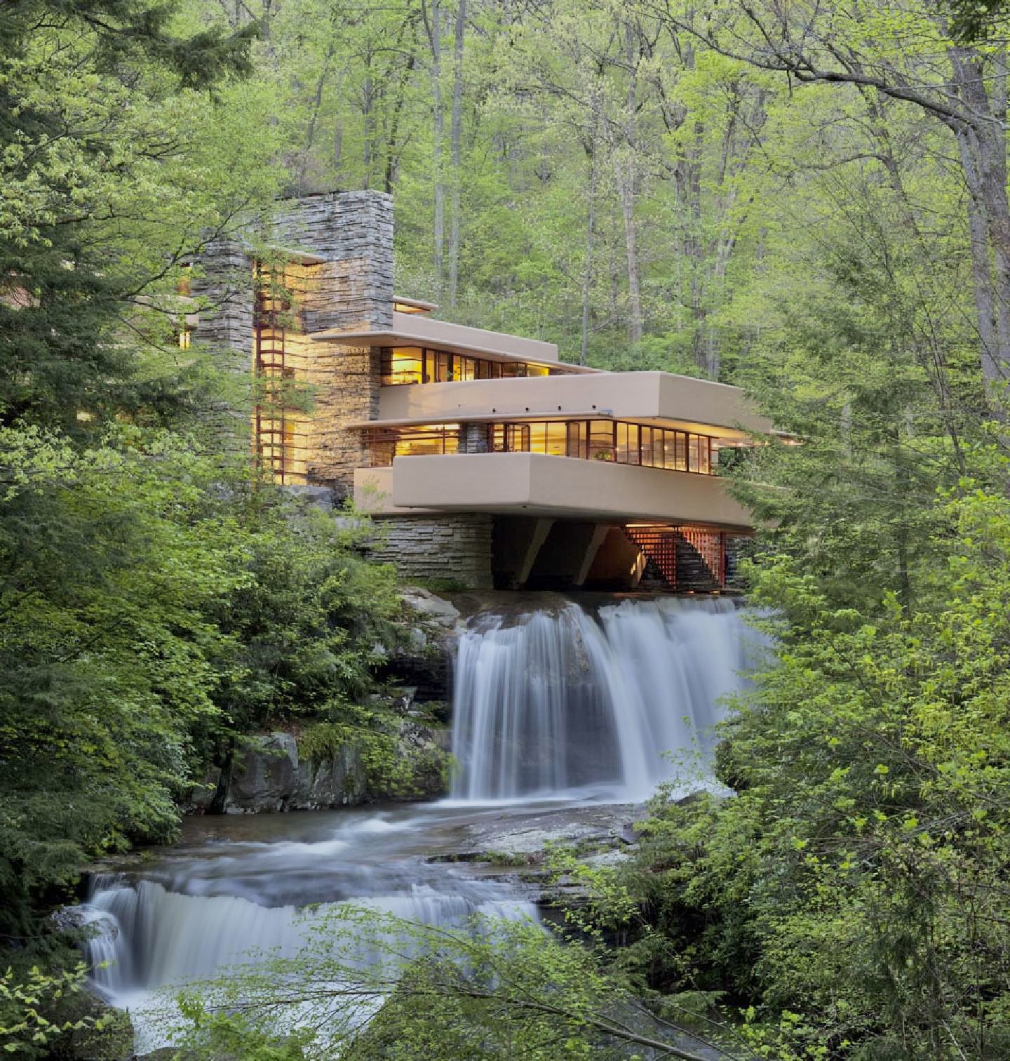
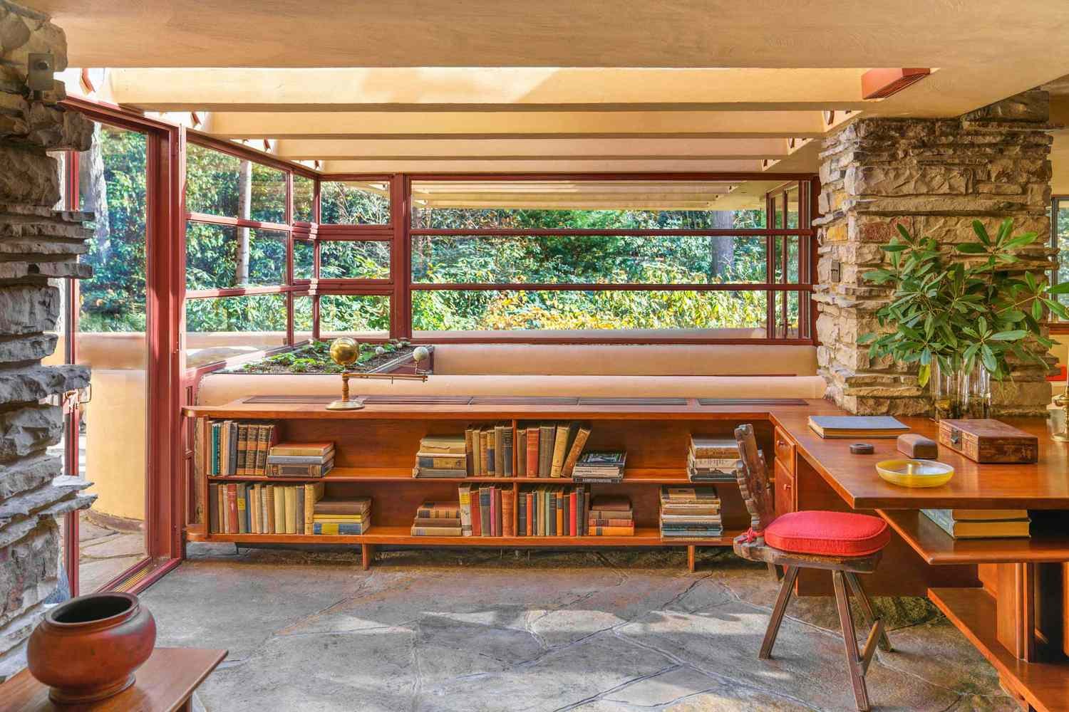
The 1970s ushered in peace, love, and unapologetic authenticity. It was a time where free spirits ran wild. Comfy, chill, and eclectic, Bohemian design celebrates the fusion of the American melting pot into one quintessentially casual American spirit. When done well, Boho doesn’t look like it’s larping as any one culture or background. Instead, it looks like the compromise between lived-in and well-traveled, with a healthy touch of plant-life in the patterns, art, and windowsill. From a design perspective, the movement emerged from nineteeth century France when artists moved into lower-rent Romani (gypsy) areas of Paris. Wealth was abandoned for pursuit of creative life. In California, areas like Sea Ranch, Big Sur, and Mendocino especially embraced non-conformist, norm-defying, vagabond, nature with glee. Frank Lloyd Wright and his famous design, “Fallingwater” is among the most well remembered Bohemian builds.
Today, America’s many chapters of interior design are alive and well. While critics may claim that Americans have no culture, our interior design history shows it in abundance.
Alina Clough lives in Washington, D.C. and is a writer at Evie Magazine. She can be found on Instagram @alinatotheleft and on X @Cluffalo.


